Overview
A federal client’s Mitigation Planning Portal is used to manage and track hazard mitigation plans across all ten regions nationwide.
As the sole UX designer on the team, I focused on improving the plan management experience in MPP 2.0 to help users look up, review, and manage plans with less friction.
Understanding the Users
I focused on Federal users, who have access across all 10 regions and the most complex workflows.
Design Challange
Funding, status, and jurisdiction data competed within a single dense view. Jurisdiction data in particular was hard to scan and review.
Users had option to either receive all notifications or none at all. For plan managers working with dozens of plans, this made tracking updates difficult and easy to miss.

Legacy Design
The earlier plan detail page tried to show too much at once without clear navigation. Funding, status, and jurisdiction data competed within one dense view, making review harder.
Ideation
Plan detail pages showed everything at once.
Give dense data its own space so jurisdiction review is a task of its own.
Notifications were all or nothing.
Let plan managers choose which alert types they receive.
Mapping the plan management workflow
I created an end-to-end workflow to understand how key tasks are connected across MPP. This helped me figure out missing pieces and where new entry points were needed.

shows features carried over from Legacy MPP.
shows new features added within existing pages for MPP 2.0.
shows new pages introduced in this design phase.
Final Designs
The final design focused on improving the two main workflows.
Reviewing jurisdiction data in a clearer space, and managing plan updates with more control.
Jurisdiction status
Problem
The plan detail page had every information about the plan and the jurisdiction data was at the bottom of that page. Most of it was read only, but plan managers also went to leave comments and check important updates like when it was approved.
Design Solution
The plan detail page was divided into two main sections. The top half was the reference information. The bottom half was a jurisidction data and I moved it to it's own separate tab so each had it's own space.
I presented the new design to the client as helping plan managers scanning the information faster and make fewer errors during review.


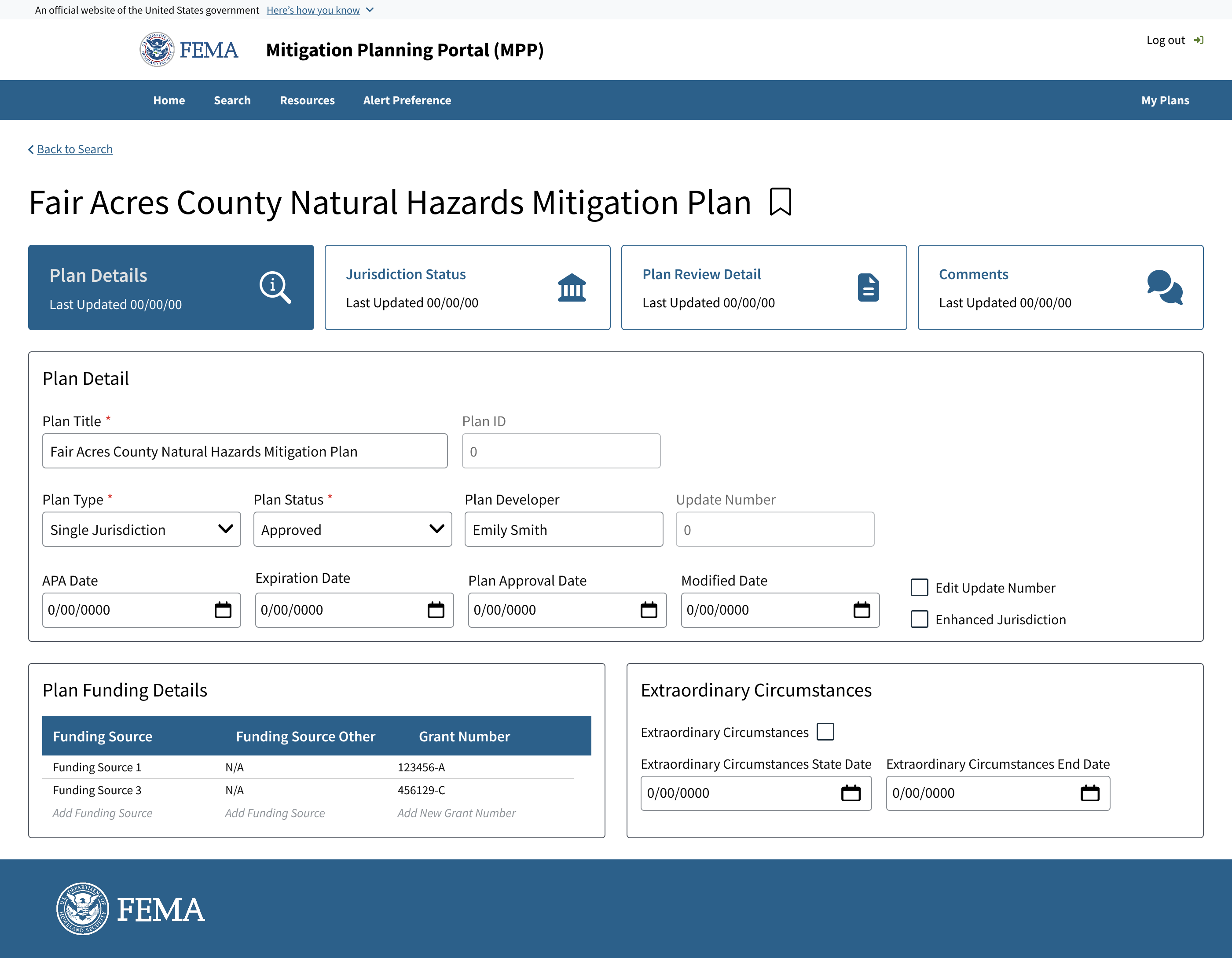
Plan Detail
Plan Detail has three main plan data. Basic details, funding sources, and extraordinary circumstances. Plan managers usually only need to verify this information, so the tab is built for a quick scan before moving on to the next tab.
Jurisdiction Data
Each jurisdiction contains a large set of fields, and in the original layout this table was crammed into the same viewport as the plan details. Separating it gives the room to breathe, so plan managers can review and edit records with fewer errors.
Alert preferences
Problem
Plan managers received too many notification or northing, with no way to filter.
Proposed Design
I explored an split-panel design to keep the users focused on the plan's list while users configured alerts across multiple plans.

Outcomes
This project did not include formal usability testing or post-launch analytics, so I do not claim measured impact. The primary outcome was a clearer plan management workflow for MPP 2.0.
The design work clarified how plan managers could review jurisdiction-level data and manage alert preferences across multiple plans. It also provided the team with a clearer structure for integrating new features into the existing MPP workflow.
