Background
A federal client’s Mitigation Planning Portal is used to manage and track hazard mitigation plans across all ten regions nationwide.
As the sole UX designer on the team, I focused on improving the plan management experience in MPP 2.0 to help users look up, review, and manage plans with less friction.
"Consolidated space of record for mitigation plan status."
— Stakeholder workshop, FEMA
Understanding the Users
MPP supports Federal, Regional, and State users, each with different levels of access and responsibility.
For this case study, I focused on Federal users, as they have the broadest access across all 10 regions and the most complex workflows.
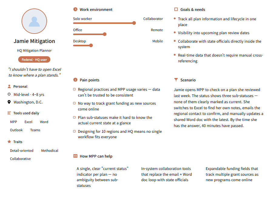
I created a working persona based on the workshop notes. This helped me translate broad requirements into a more realistic day-to-day activity.
"I shouldn't have to open Excel to know where a plan stands."
Pain Points
While previous versions of MPP managed many plans, the user experience remained challenging for plan managers. The workflow did not consistently support quick resumption of work, activity tracking, or monitoring updates across multiple plans.
The status dashboard did not give users a direct way to return to the plans they were working on. To resume work, users had to search for the same plans again.
Plan managers needed a reliable way to document activity logs and leave comments tied to a plan.
Users could either receive all notifications or none at all. For plan managers working with dozens of plans or more, this made prioritizing updates difficult and easy to miss.
"Manually looking up and entering jurisdiction data can be tedious."
— Stakeholder workshop, FEMA
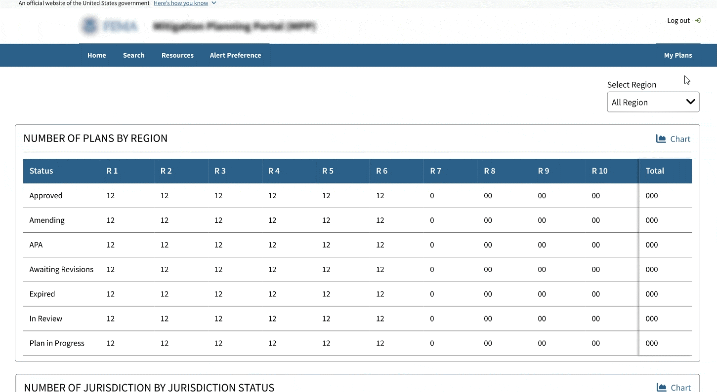
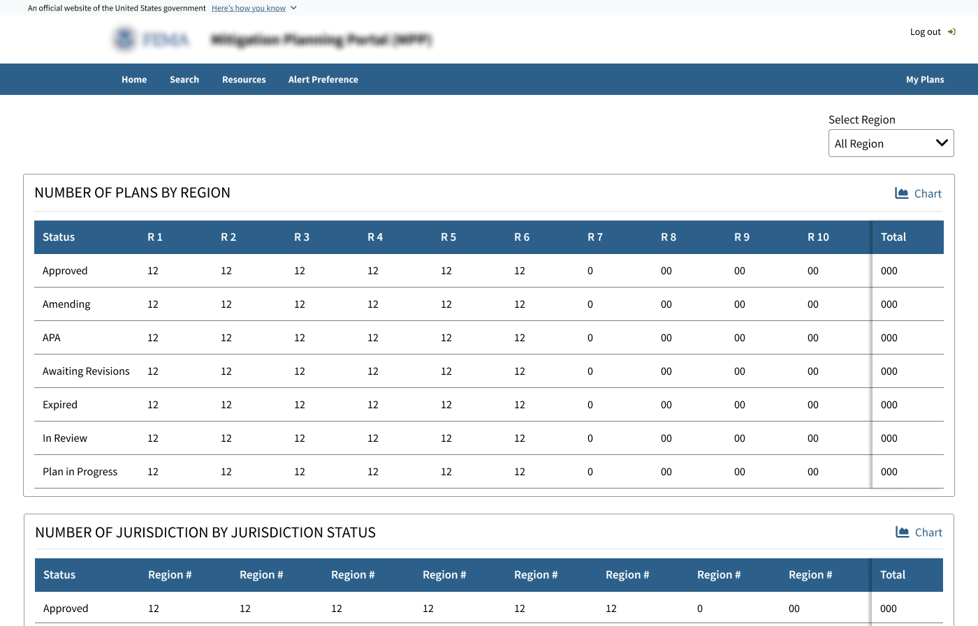
Legacy Experience
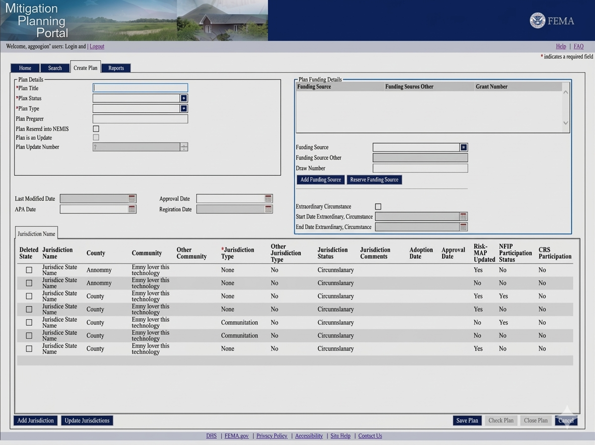
The earlier plan detail page tried to show too much at once without clear navigation. Funding, status, and jurisdiction data competed within one dense view, making review harder.
Ideation
Design directions emerged directly from the pain points covered in stakeholder workshops. Working through rounds of client reviews, each feature proposal was grounded in a specific gap in the existing workflow.
Returning to assigned plans could be easier.
Create a clearer entry point to my plans page.
All-or-nothing notification model overwhelmed analysts managing large number of plans
Create a more customizable alert preference model so plan managers can choose which alert types to receive.
Plan detail pages tried to show everything at once.
Restructure the page so that pages with complex data fields has its own space for better readability.
Mapping the plan management workflow
I created an end-to-end workflow to understand how key tasks are connected across MPP. This helped me figure out missing pieces and where new entry points were needed.
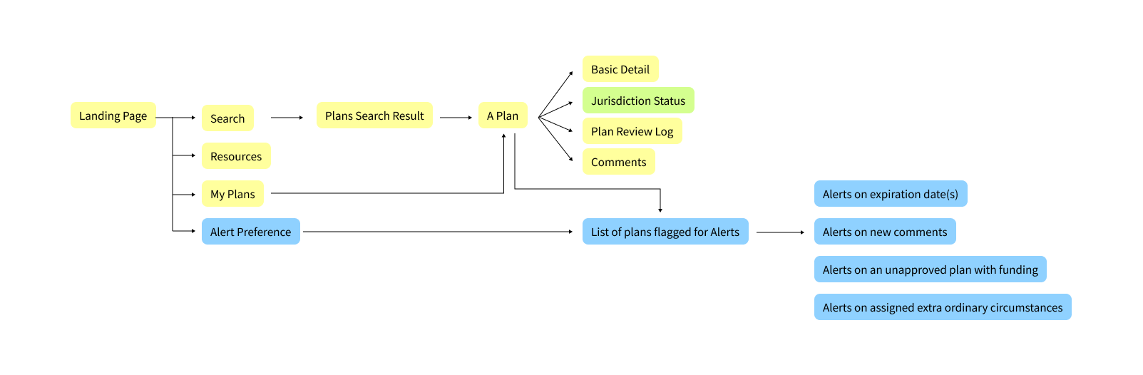
Yellow shows features carried over from Legacy MPP.
Blue shows new features added for MPP 2.0.
Green highlights a design recommendation documented in this case study that was not included in the delivered version.
Final Designs
The final design focused on improving the three main workflows. Helping plan managers access assigned plans, reviewing jurisdiction data in a clearer space, and managing plan updates with more control.
Assigned plans and My Plans
Introduced a feature takes plan managers directly to their assigned plans and allows them to save plans for quick access.
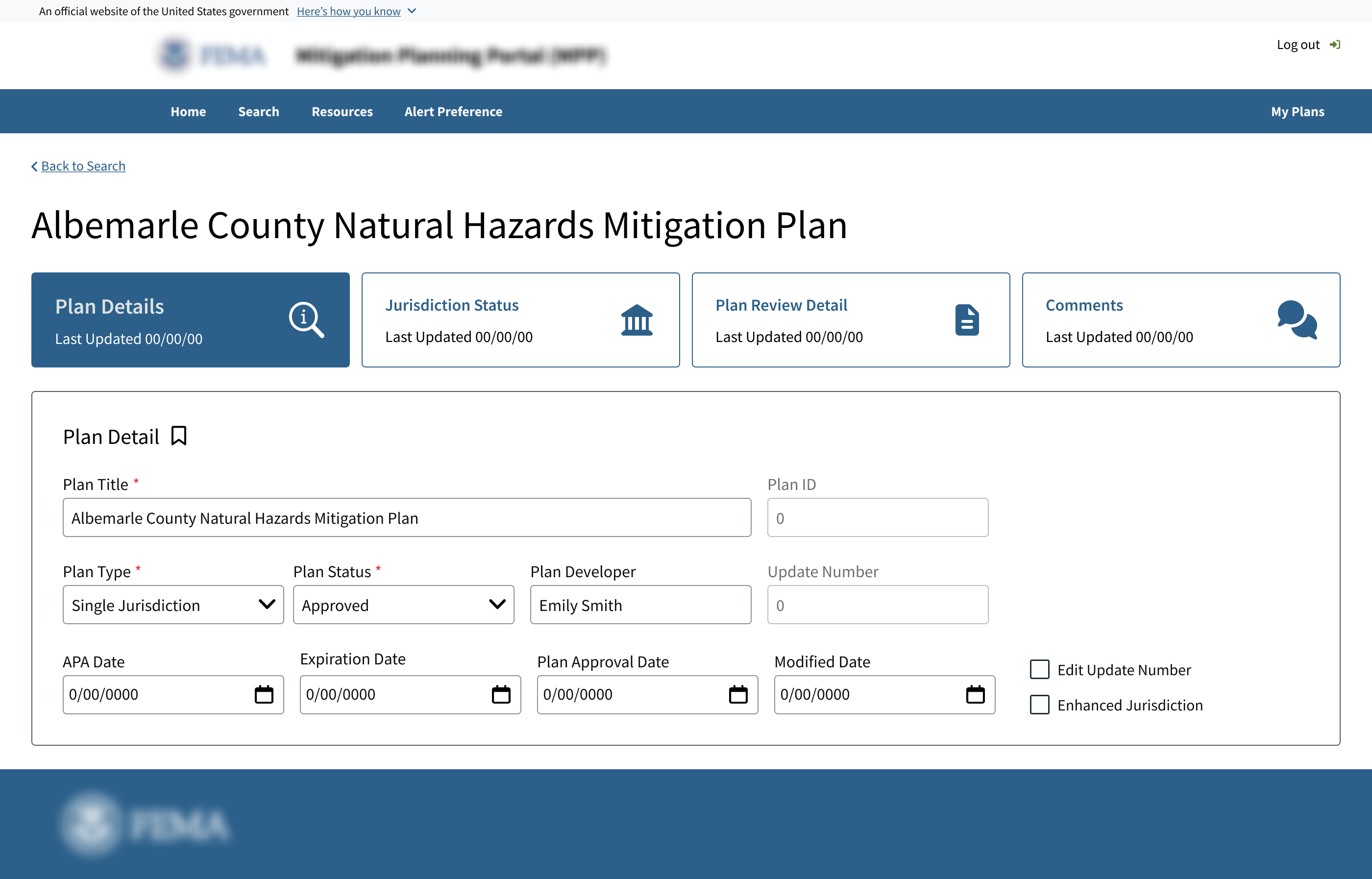
Jurisdiction status
Created a dedicated space for jurisdiction-level review instead of keeping the table inside a crowded plan detail page.
Initial pain point: The plan detail view contained too much information, making jurisdiction data harder to scan and review.
Design Decision: I moved jurisdiction status into a dedicated tab and treated it as its own review task, rather than burying it inside the general plan detail page.

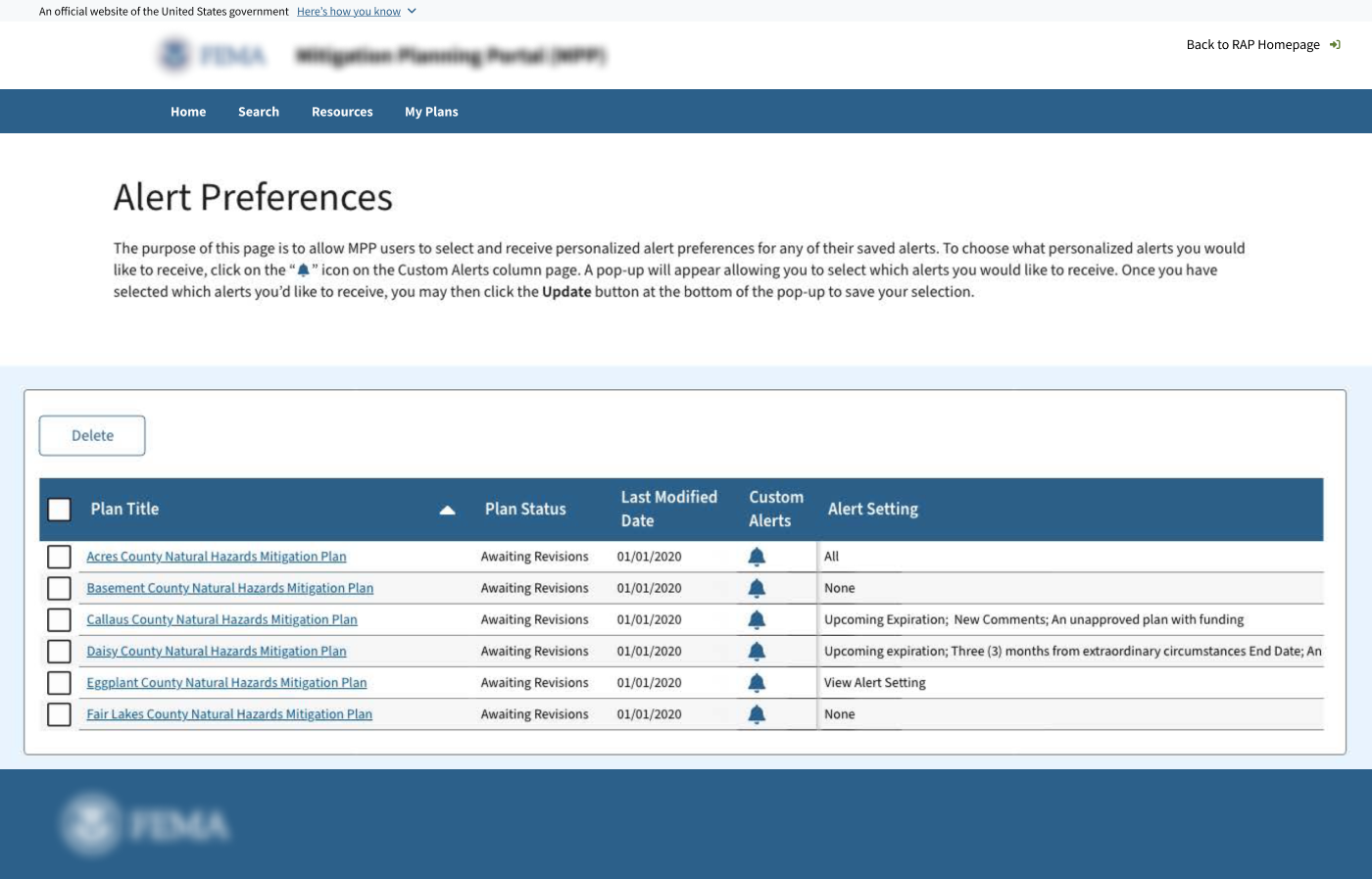
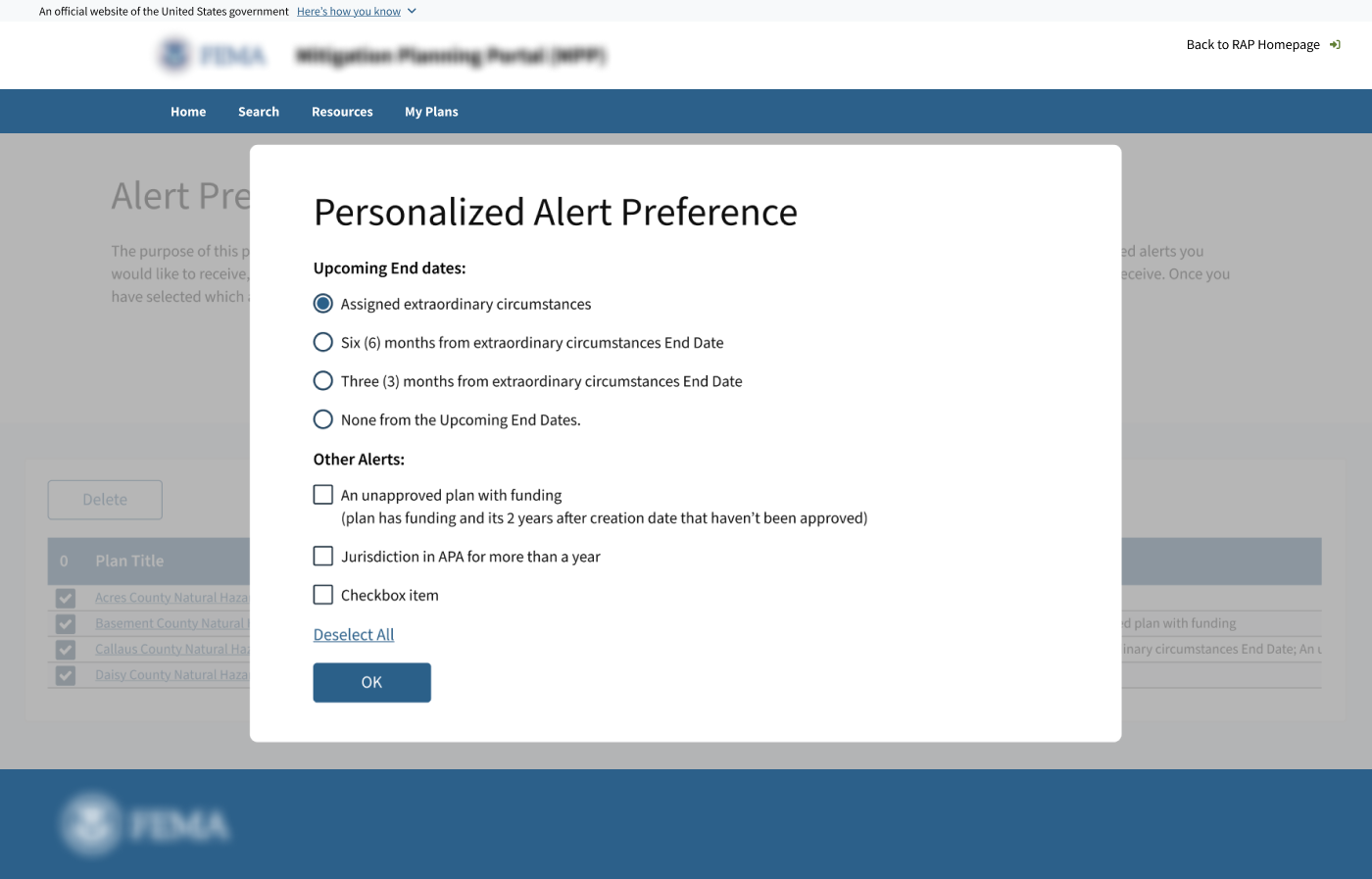
Alert preferences
I explored various approaches to give plan managers more control over their notifications and prevent from receiving too many notifications that aren't relevant.
Problem
Plan managers needed more control over notifications.
Client approved version
The client-approved direction triggered a modal from a bell icon inside a table.
While this met basic requirements, it disrupted the workflow by pulling user's attention from the plan list every time they configured alerts.
Proposed Design
I explored an alternative split-panel design to keep the users focused on the plan's list while users configured alerts across multiple plans.
For plan managers working with multiple plans, customizing alerts is not a one time action. Keeping the plans visible made the experience feel more like managing updates.
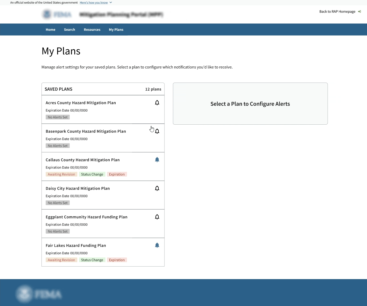
Although the alternate version was not approved by client, I included the split-panel version for this case study because it better reflects the problem I was trying to solve.
The embedded Figma prototype may not load consistently, please click the link to view the full prototype.
View full prototypeOutcomes
This project did not include formal usability testing or post-launch analytics, so I do not claim measured impact. The primary outcome was a clearer plan management workflow for MPP 2.0.
The design work clarified how plan managers could review jurisdiction-level data and manage alert preferences across multiple plans. It also provided the team with a clearer structure for integrating new features into the existing MPP workflow.