01 — Overview
Overview
SAM.gov is the U.S. federal government’s central platform, managed by the General Services Administration (GSA), for contract opportunities, entity registration, and other federal records. During this period, GSA was consolidating ten independent federal services into a unified system.
My Role
As a designer, I reviewed the current state of the search results page, examining its application across various domains to identify key areas of pain points and potential improvements. My primary objectives focused on enhancing the site’s visual appeal and usability.
02 — The Challenge
Challenge
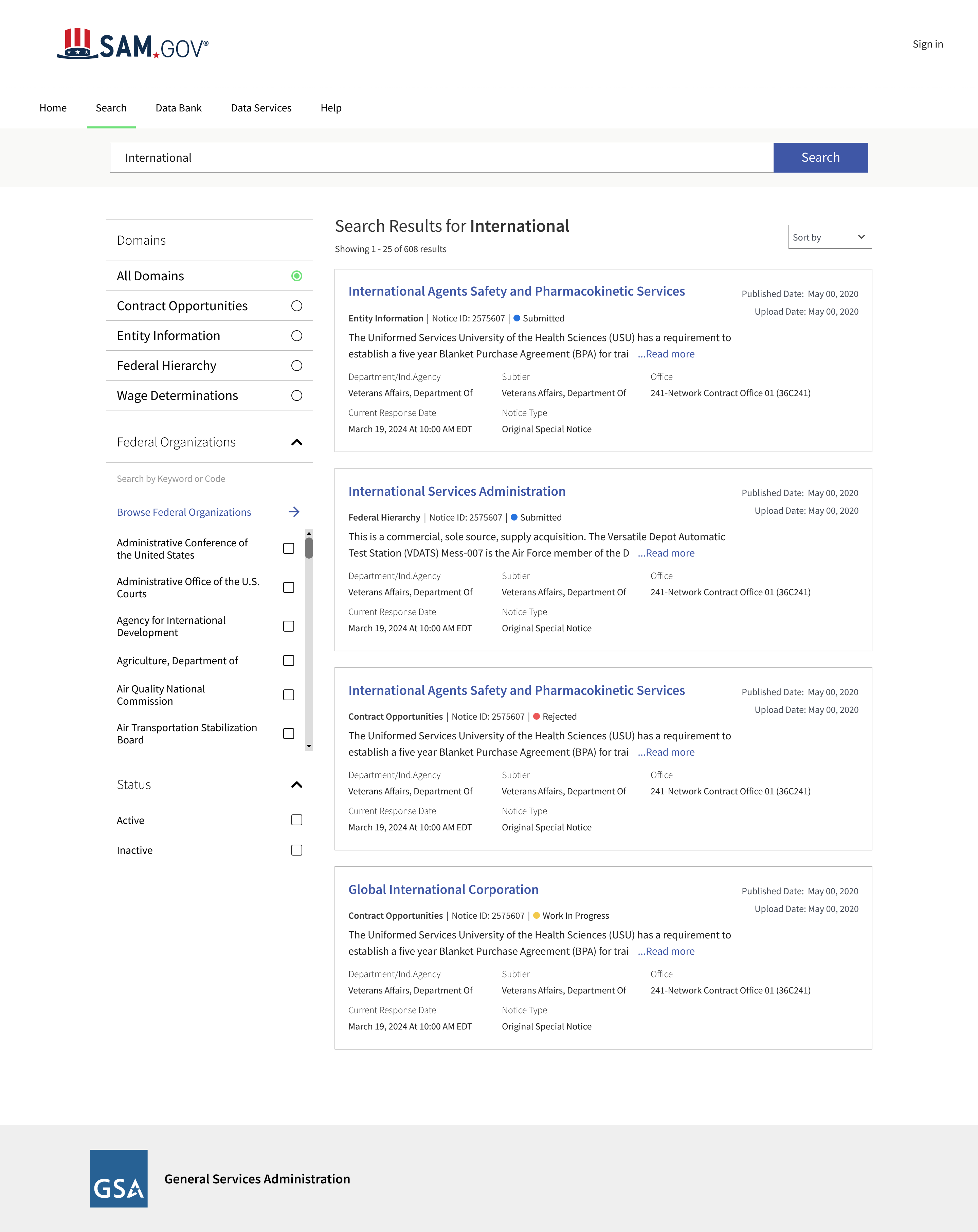
Before SAM.gov was unified, each of the 10 legacy systems had its own search experience. After merging these systems into a single platform, the search results page was required to support multiple types of federal records simultaneously .
However, the existing interface did not effectively enable users to understand, compare, or filter results across domains, resulting in an outdated and challenging search experience.
03 — Discovery
Discovery
I reviewed familiar search platforms to see how they manage lots of results, filters, and how users scan information. My goal was not to copy them, but to find out what makes some search experiences easier to use.
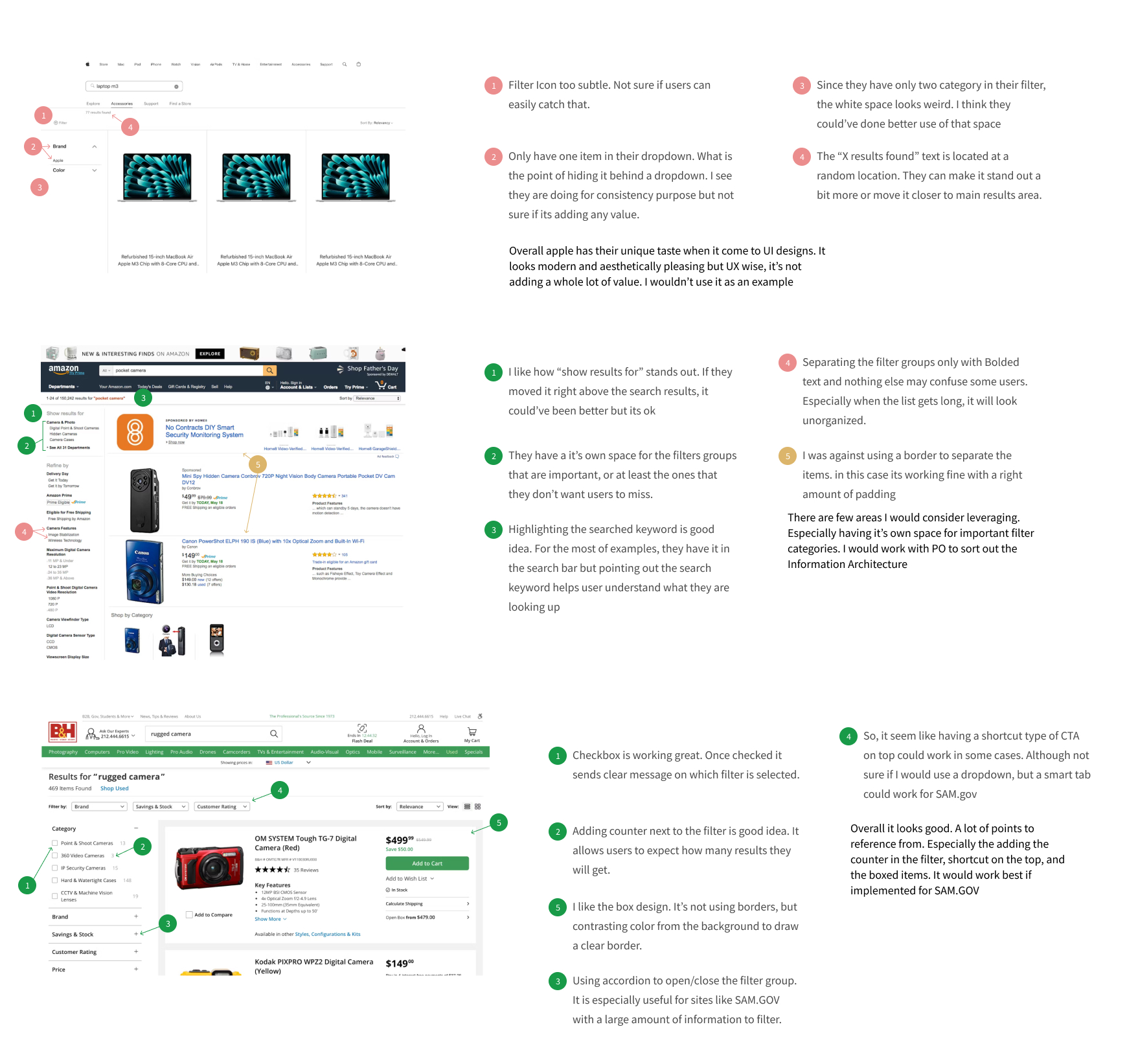
| Pattern I reviewed | Source | Why it mattered for SAM.gov |
|---|---|---|
| Dedicated space for high-priority filter groups | Amazon | Filter panel restructured to surface key parameters |
| Result counter next to filter options | B&H | Helps users anticipate result volume before committing |
| Accordion pattern for large filter sets | B&H | Adopted for complex parameter groups |
| Shortcut navigation at top of results | B&H | Evolved into domain shortcut buttons |
| Contrasting background instead of borders for cards | B&H | Cleaner card separation without visual noise |
| Single-item dropdowns add no value | Apple | Removed unnecessary dropdown wrappers in filter |
Usability Testing
Because formal user research was not available during the work, I later tested the redesigned flow with two subject matter experts who were familiar with federal search and procurement workflows.
This was not a formal research study, but it helped me understand whether the design direction addressed the issues I had observed during the project.
Following were the key findings from the user testing.
- Search results were hard to scan — Content felt grouped arbitrarily, making it harder to read relevant information quickly.
- Page felt visually overwhelming — Filter navigation, dense metadata, and unclear groupings made the results page as a whole feel cluttered and difficult to navigate.
05 — Ideation
Ideation
Wireframes
Three layout directions were explored before arriving at the final design. Each concept addressed part of the problem but revealed new constraints that shaped the direction forward.
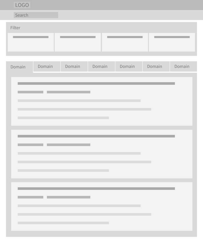
Concept 01 — Horizontal Filter Bar with Domain Tabs
Filters placed in a horizontal bar above results, with domain-based tabs to section results by type. The layout was compact, but it quickly became crowded as more filters and domain-specific options were added.
- Horizontal filter bar was too limited for complex parameter sets
- Not mobile friendly
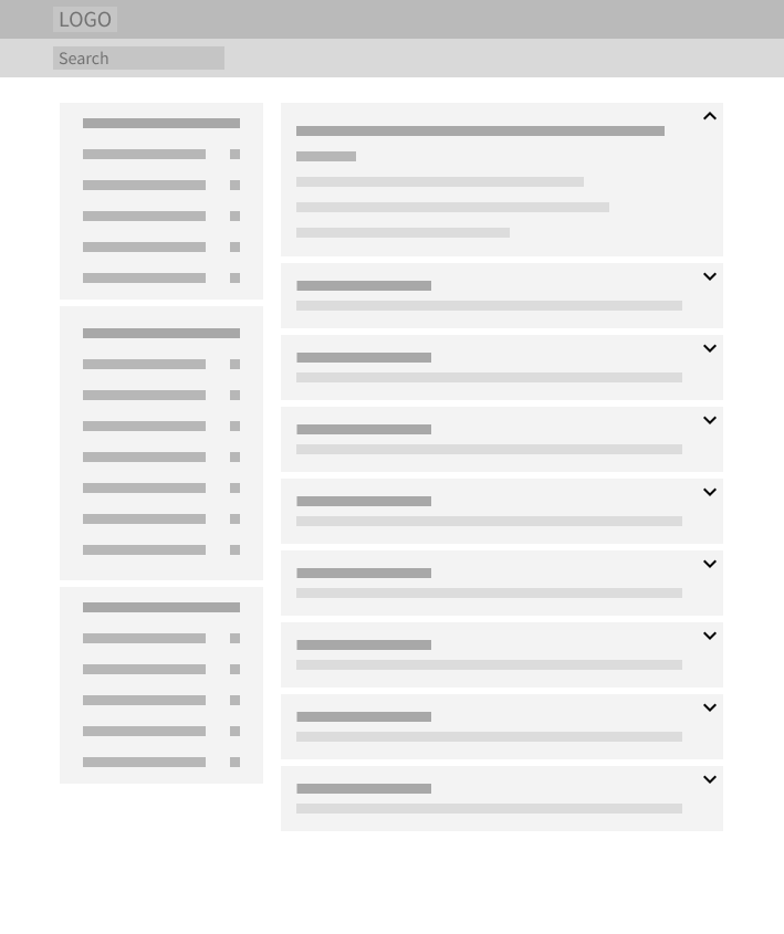
Concept 02 — Accordion Result Cards
This version explored collapsible result cards, where users could expand each result to view additional details. It reduced visual density, but users might miss important information if they were collapsed by default.
- Collapsing details created a risk of hiding critical information
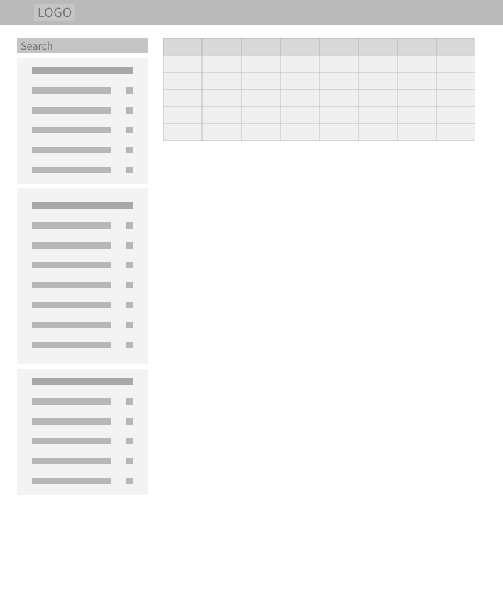
Concept 03 — Table View
This one referenced USAspending.gov’s table .It made the results feel more scannable, but it was not the right fit for SAM.gov. Many SAM.gov results are context-rich records that require reading and evaluation.
- Table format was not suitable for informational content
- Also not mobile friendly
06 — Final Design
Final Design
Filters were reorganized into a more guided refinement panel
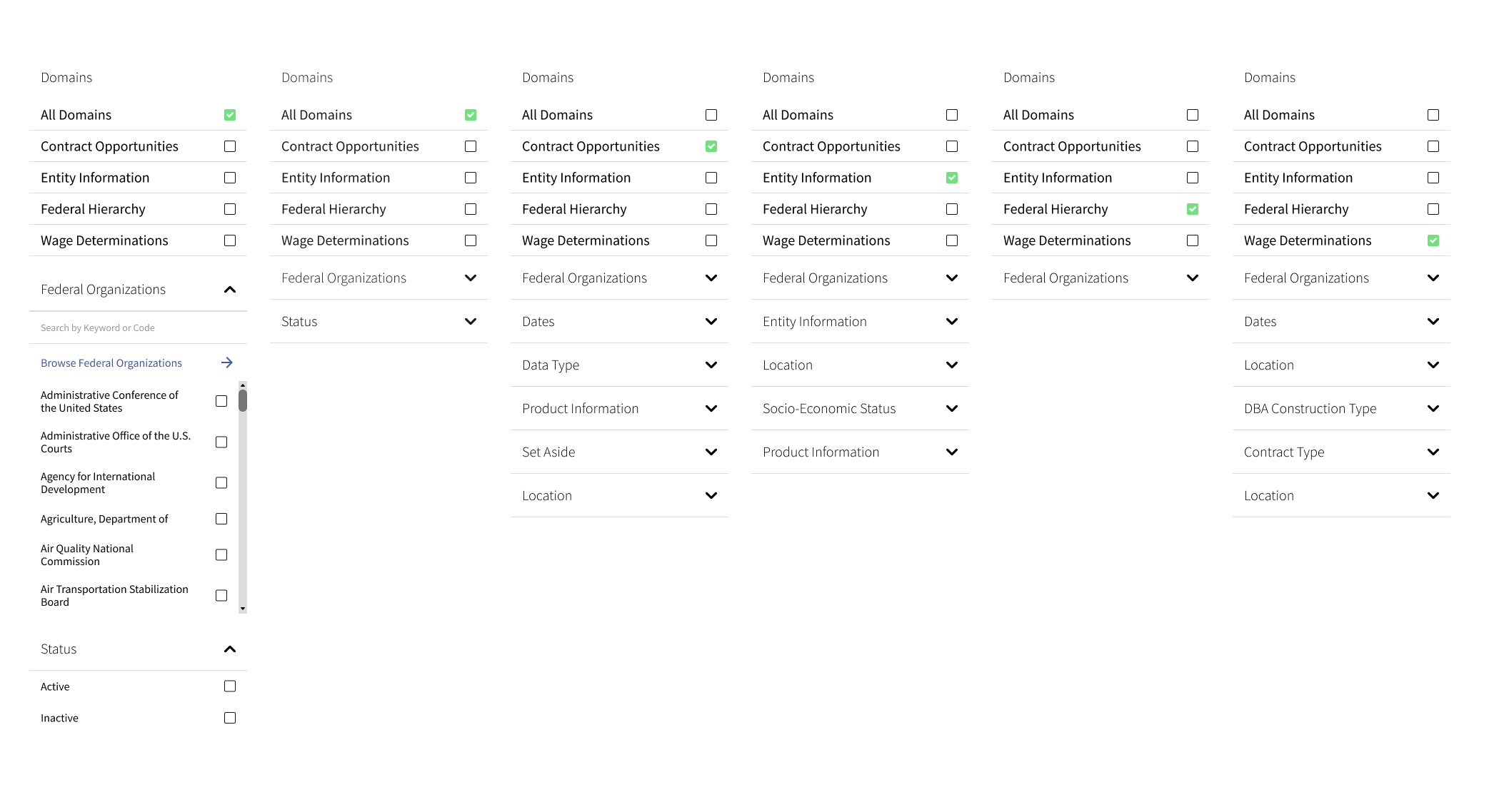
I redesigned the filter panel to feel more guided and easier to parse, giving users a clearer starting point for refining large result sets.
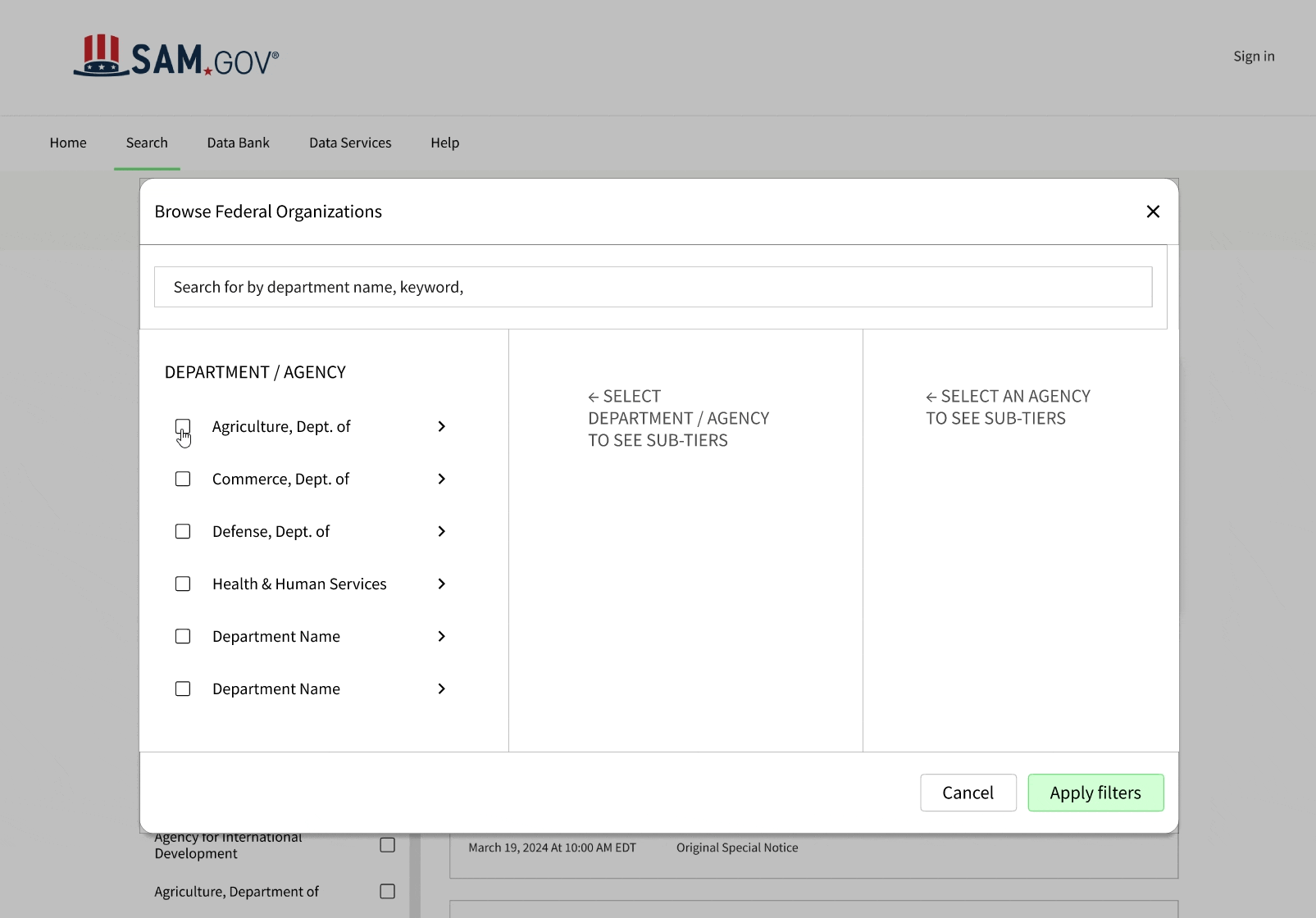
One of the more complex interactions on the filter was selecting a federal organization.
I redesigned the modal into a multi-column checkbox group so users could browse department, subtier, and office levels more naturally.
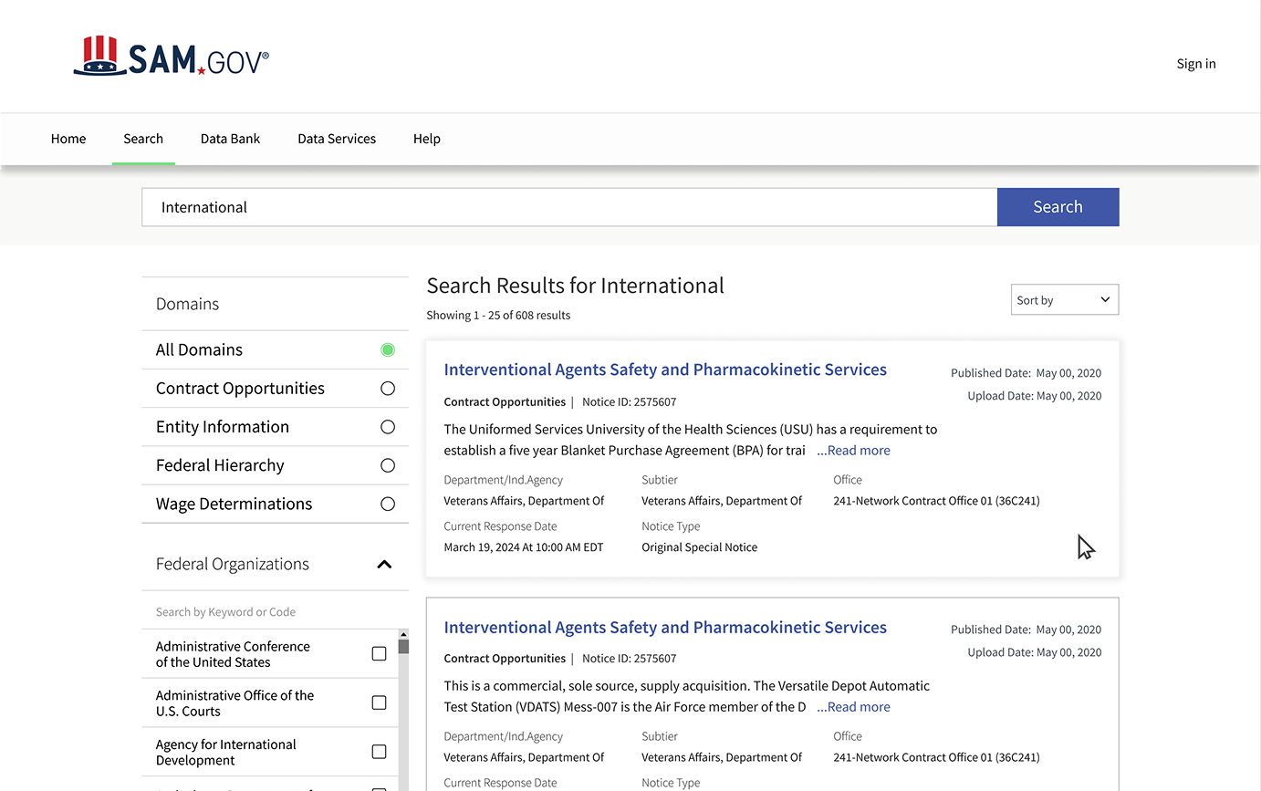
Result cards were redesigned for faster scanning
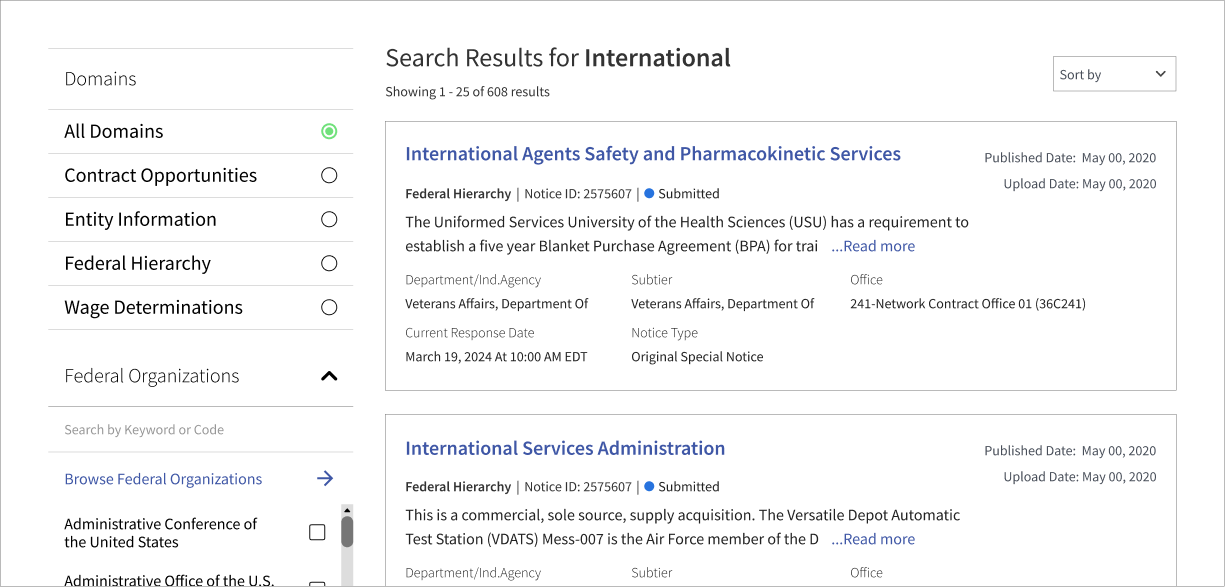
Titles and domain types were surfaced first, followed by short summaries and supporting metadata, so users could quickly scan without reading each result in full.
The embedded Figma prototype may not load consistently, please click the link to view the full prototype.
View Figma Prototype