Opening Page
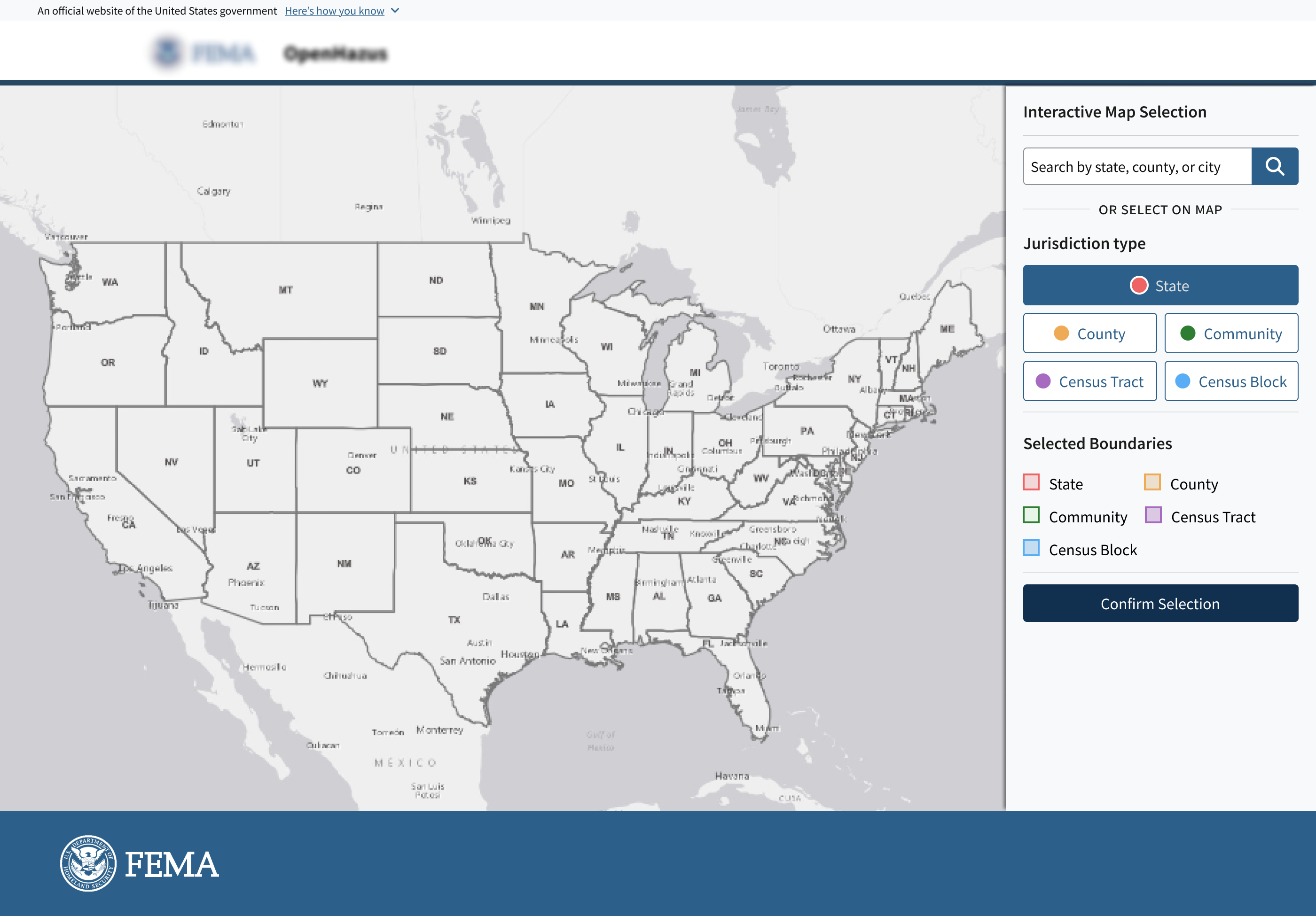
The analyst lands on the full U.S. map with two ways to begin: selecting a state directly from the map or searching by state, county, community, or city.
Redesigning the geography selection step of a hazard analysis workflow, making geospatial boundary selection accessible to analysts across all technical backgrounds.
The Interactive Map is one of the first steps in the workflow for generating the risk analysis report. Analysts use it to select the geographic boundary for their analysis, which defines which area will be included in the report. However, this selection process can be complex and not clearly explained.
I redesigned the interactive map experience to make geographic selection clearer and easier to confirm before users move forward with report generation.
The existing platform was built on an ArcGIS-based application. It was robust for users with GIS expertise, but confusing for non-specialist users.
While the platform offered many advanced tools, not every user needed that level of complexity to define a geographic boundary and run an analysis. This created a steep learning curve for users who were unfamiliar with GIS tools.
The design challenge was to simplify the map-based selection workflow while still supporting the accuracy and flexibility required for hazard analysis.
The redesigned workflow helps users move from an initial map view (landing) to a defined geographic selection with more clarity and flexibility.
Landing
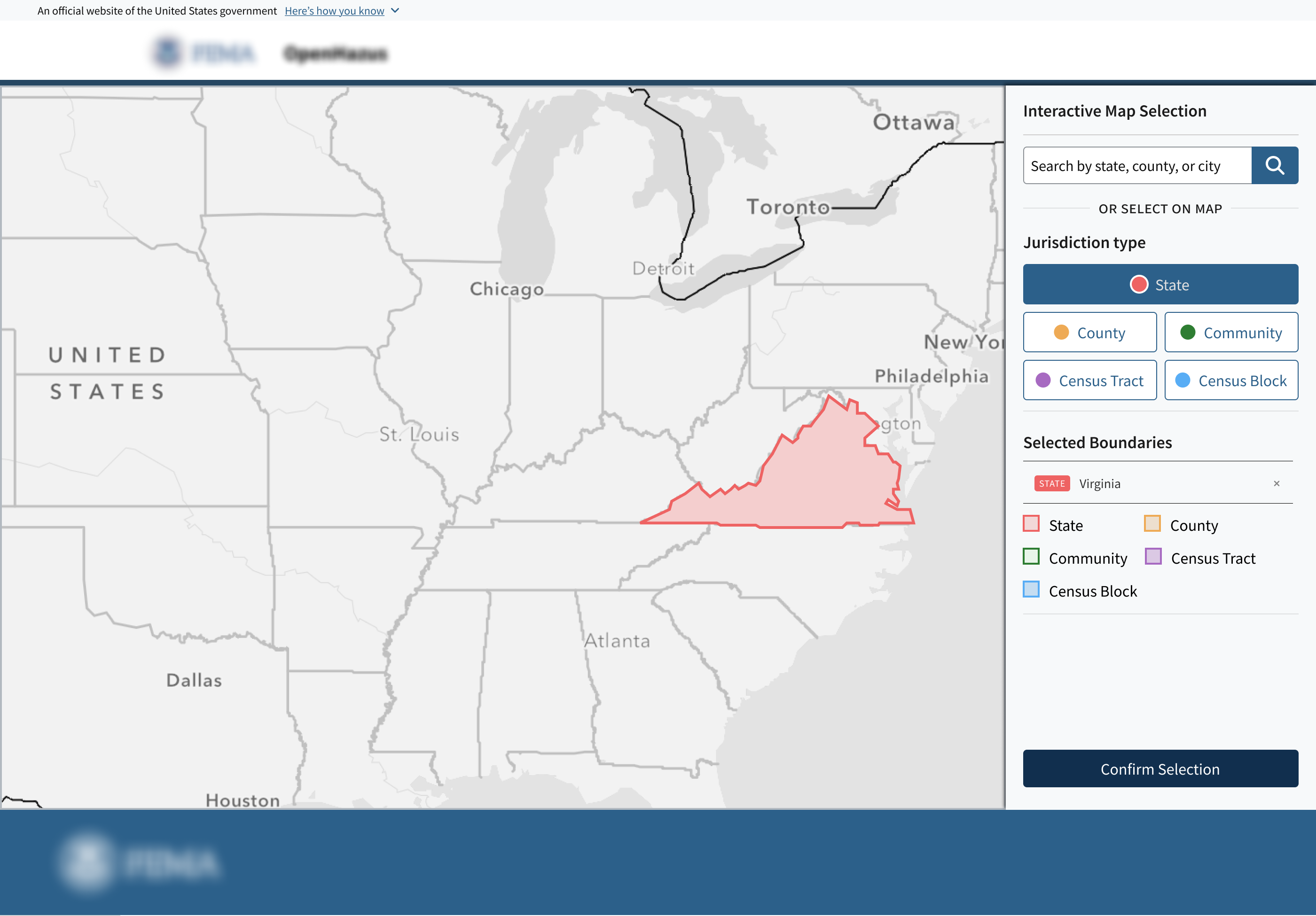
State selection
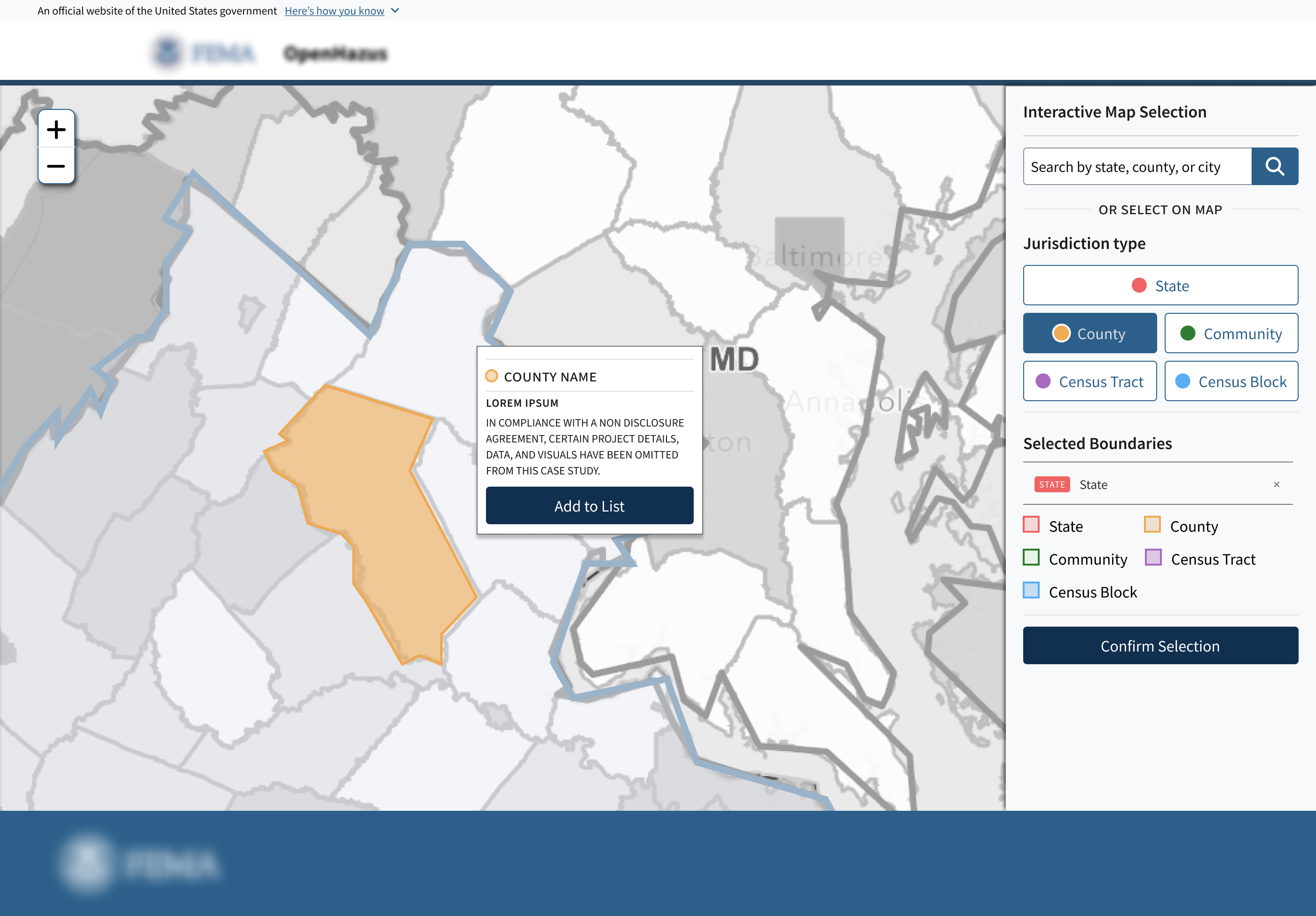 County selection
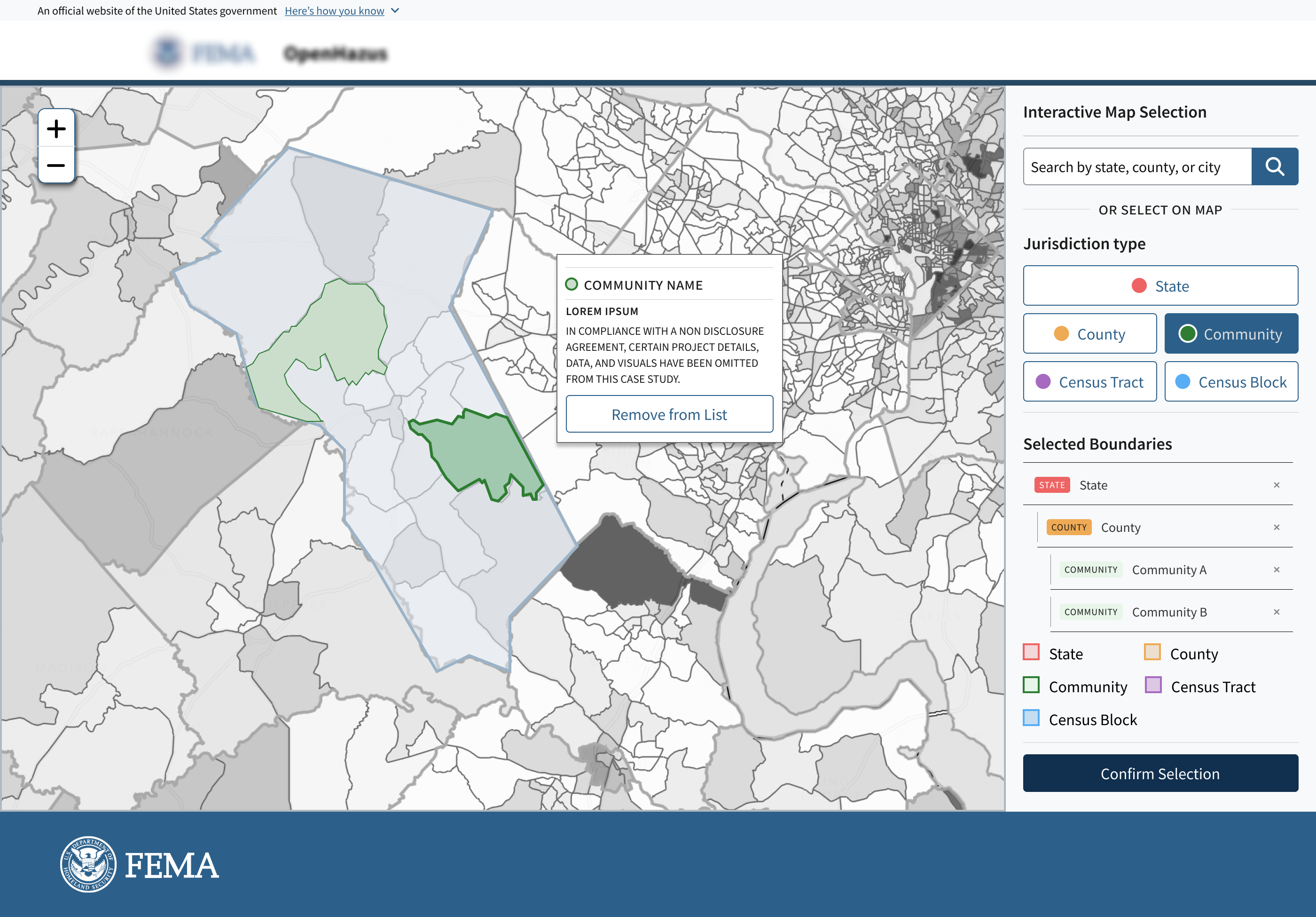 Community selection
To understand how users interact with the map, I reviewed existing business requirements and participated in client workshops with stakeholders who work closely with analysts.
I was able to identify three key user groups with different levels of GIS familiarity and analysis needs:
They usually know the exact location they need, but have to go through extra steps to find it.
They know how to use the interface, but get frustrated by how many steps it takes to do tasks they already know.
They often handle a lot of data at once, so they need to be sure they have picked the right area before moving on.
Select a study area quickly without needing to understand the underlying GIS data structure.
Clearly understand what is selected on the map at every point in the workflow.
Select and confirm the correct geographic area for analysis, then move on to the next step with confidence.
A complex map does not need a complex workflow. Because users were already looking at a dense map, the redesigned flow needed to reduce cognitive load by helping them focus on one action at a time.
Maintain map context — Allow users to make location decisions while keeping the selected geography visible and understandable.
Increase selection confidence — Make it clear what is selected, what is active, and whether the user is ready to move forward.
Simplify the path to selection — Reduce unnecessary hierarchy and support both guided exploration and direct search.
To simplify the selection process, I explored multiple interaction models to understand how users could find and select jurisdictions while maintaining the map as the central element of the workflow.
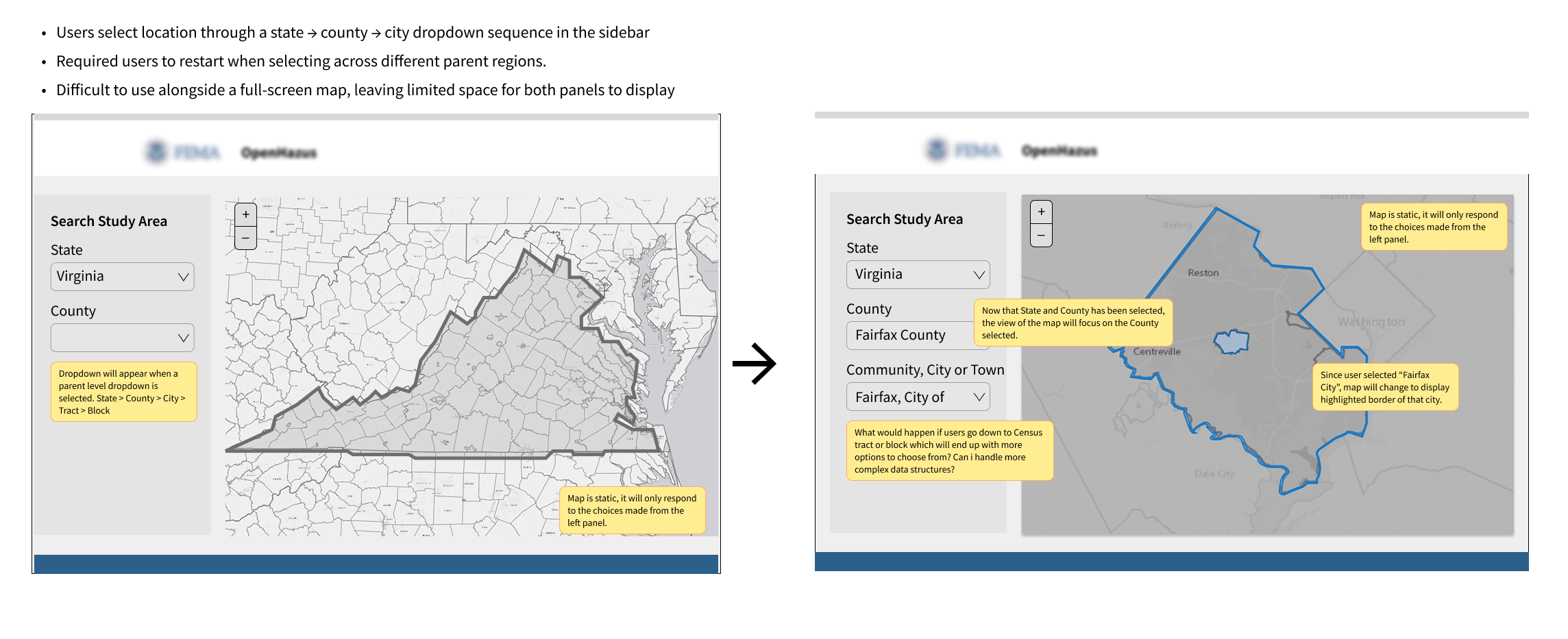
I first explored a structured sidebar flow using dropdowns. Starting with the State and arriving at the Census Block. This created a clear sequence, but it still depended on a rigid hierarchy and pulled too much attention away from the map.
A side panel showing the active jurisdiction and its relationship to the parent level was definitely a keeper.
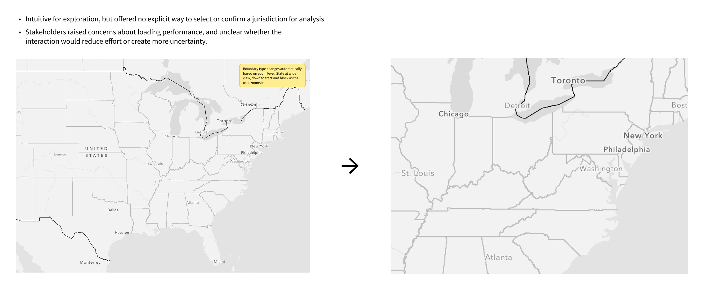
I also explored whether the map could guide the workflow by changing boundary detail based on zoom level. This felt more natural since most people are familiar with Google Maps, but it did not give users enough control to explicitly select and confirm a jurisdiction for analysis.
Zoom in/out was not sufficient enough for this user cases. Users still needed a clear selection model, visible states, and a confirmation step before moving forward.
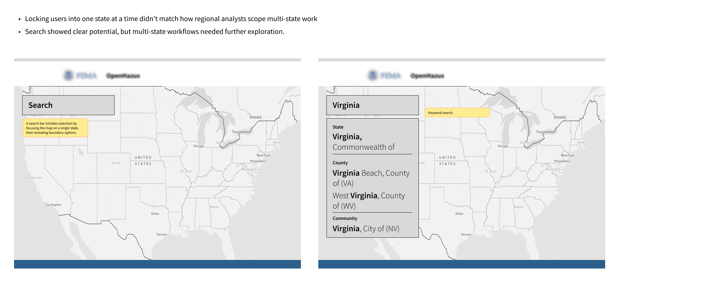
Finally, I explored a search approach for users who already knew the area they needed. This made it faster to get started and meant they didn’t have to click through every map layer.
Search integration showed clear potential for faster location lookup and carried into the final design as a map-integrated search bar.
Each concept had something worth carrying forward. The final design incorporates all three of these elements while addressing the visual feedback issues that none of them had fully resolved.
Based on the concepts explored, I narrowed the final design direction to three ideas:
Improved search experience
For users who already knew the jurisdiction name or FIPS code, the search provided a faster path into the map flow without requiring them to manually navigate through each geographic layer.
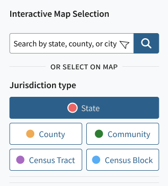
Boundary selector buttons
I designed boundary selector buttons that let users select a state first, then choose a boundary type without navigating through every geographic level.
Selected-boundaries summary panel
I paired map symbology with a selected-boundaries panel so users could verify where the selected area was on the map and how it fit into the broader geographic hierarchy.
Together, these decisions shaped a map-centered workflow that enables users to find, select, and confirm geographic boundaries with less friction.
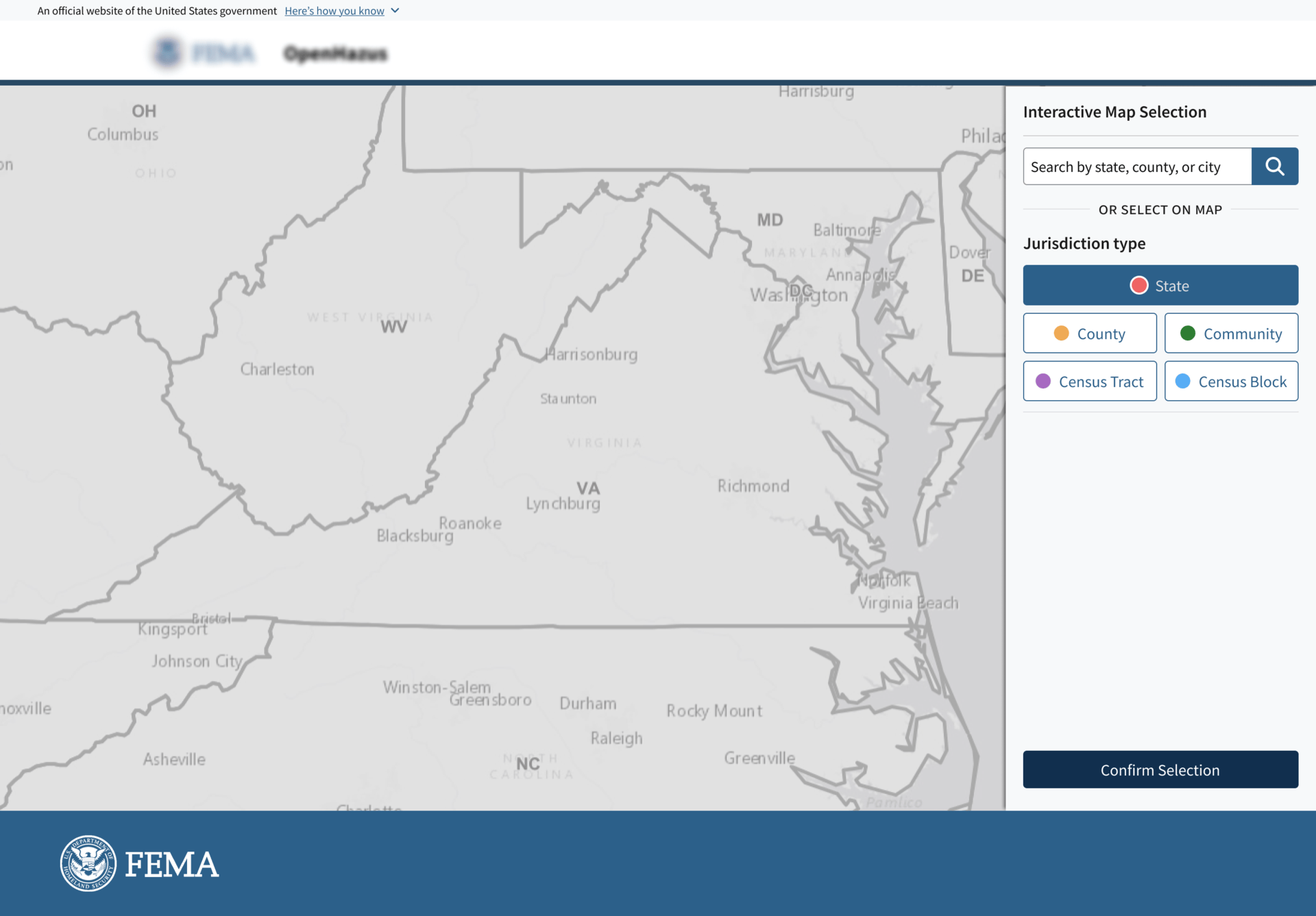
The redesigned Interactive Map keeps the geography selection process on the map. Analysts can search for a location, select a state, switch between boundary types, and confirm their selection without leaving the map workflow.
The analyst lands on the full U.S. map with two ways to begin: selecting a state directly from the map or searching by state, county, community, or city.
After selecting a state, the analyst can choose the boundary type they need: County, Community, Census Tract, or Census Block. The map updates to match the selected boundary type instead of forcing users through a fixed sequence.
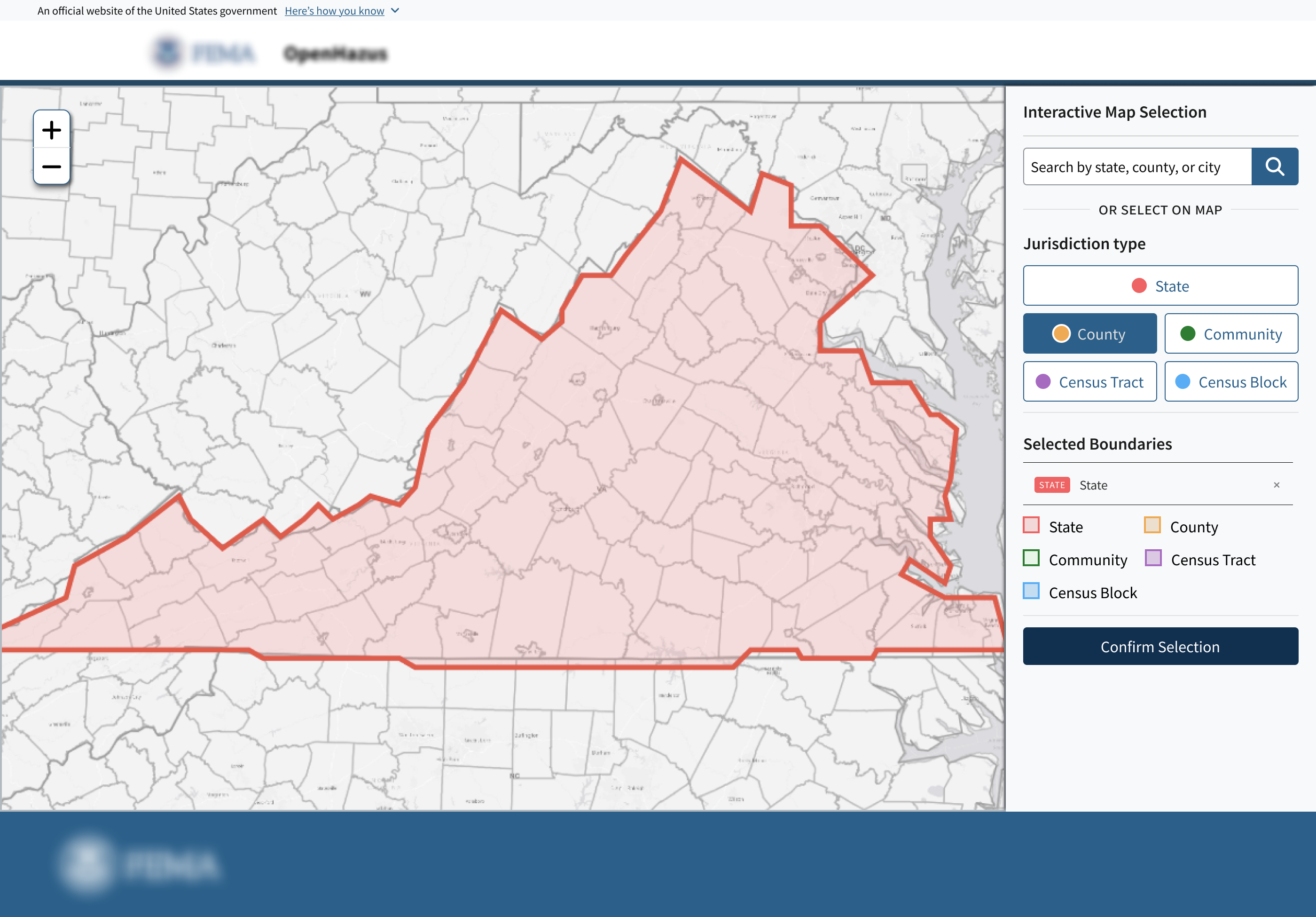
With Virginia selected, choosing County redraws the map to show county boundaries within the state. Users can switch to another boundary type without restarting the flow.
Selecting a county highlights the active jurisdiction while dimming surrounding areas. A selection card appears next to the chosen area, showing location details and a clear option to add it to the study area.
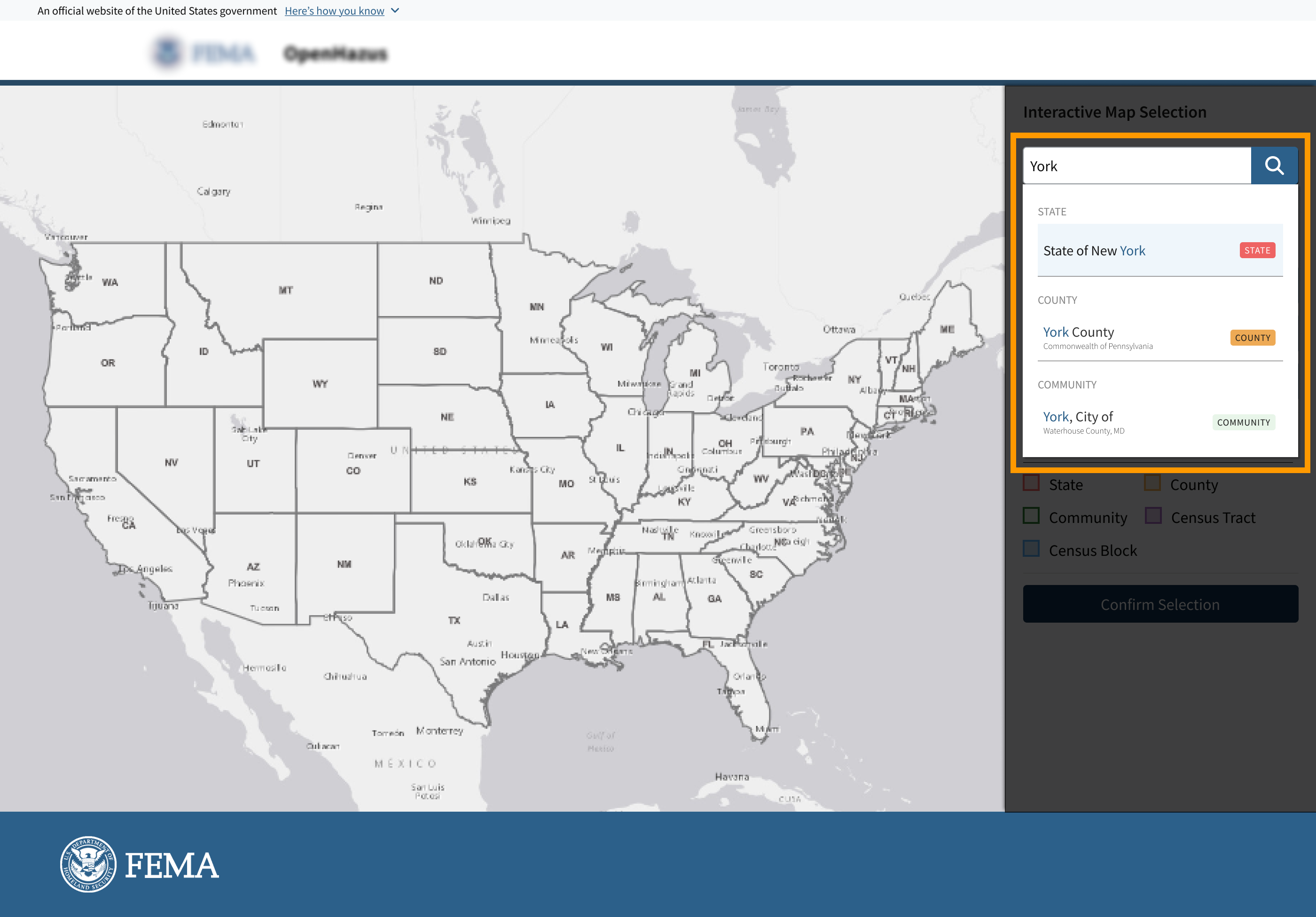
For analysts who already know the the location name or jurisdiction ID, search provides a faster entry point than navigating the map manually.
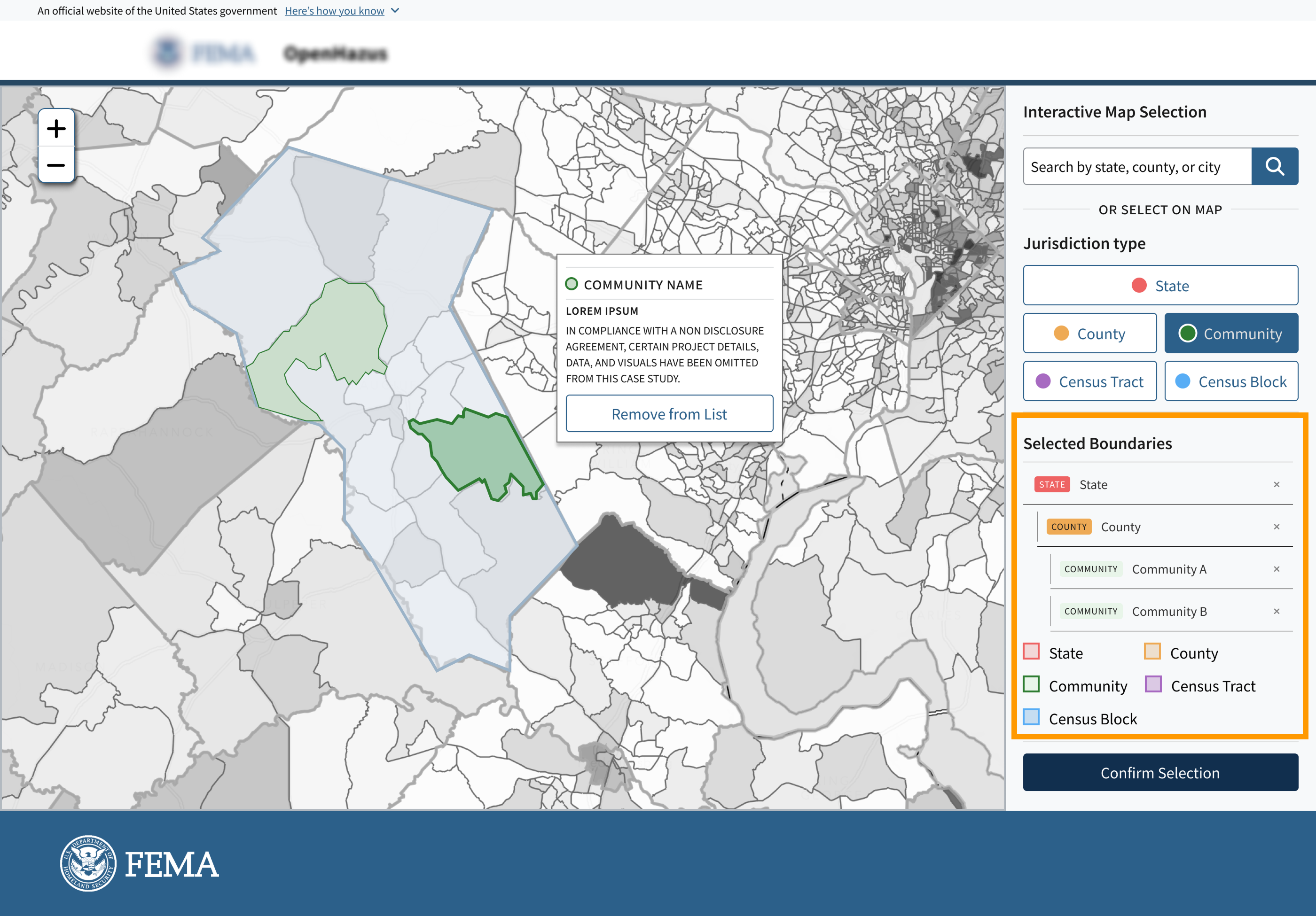
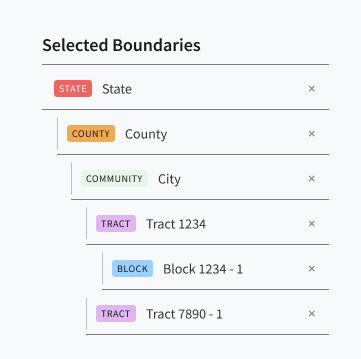
As analysts make selections on the map, a summary panel on the right keeps track of what has been added to the study area.
The selections are organized by hierarchy, allowing users to see both the boundary level and the specific jurisdictions they selected at a glance.

Analysts can switch between State, County, Community, Census Tract, and Census Block boundaries without restarting the selection flow.
The selector tool reduced the need for a rigid drill-down method and gave analysts more direct control over the geographic level they wanted to analyze.
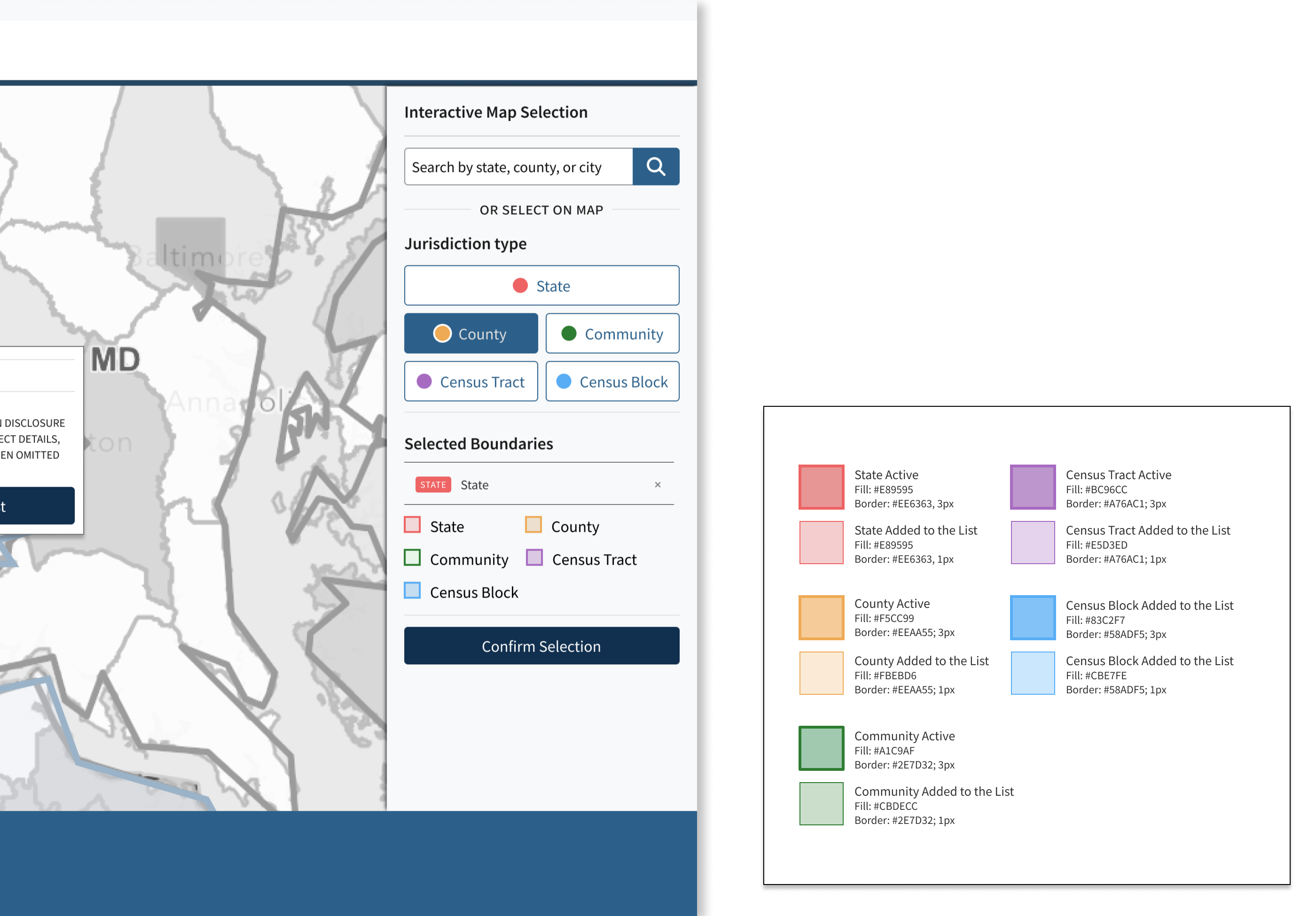
I created the palette using the U.S. Web Design System by combining unique colors with varying border thicknesses.
This helped reduce reliance on GIS-specific map patterns and made it easier to distinguish between active, selected, and available boundaries.
The new Interactive Map Viewer gives analysts a clearer, more flexible way to define a study area before creating a risk analysis report.
Reduced reliance on a rigid State → County → Community drill-down flow
Improved visibility of selected jurisdictions through map feedback and a selected-boundaries panel
Supported both users who wanted guided exploration and users who already knew the jurisdiction they needed
State selection, boundary-type switching, selected-boundaries summary, and confirmation flow.
The search feature was presented in a final review session. The project concluded before formal approval was given from the client.
Improved multi-state selection, advanced search, symbology refinements, and post-selection confirmation are left as future design opportunities.
One thing I learned from this project is that having complex and extra controls doesn’t always guarantee a better user experience. A better experience happens when things are simple and give users just enough tools to get their job done with confidence.